Take Control on Your Data

Introduction
Always Be Learning helps organisations build a stronger relationship with their own data. In a world filled with dashboards, tools, and fragmented information, the studio focuses on something more human: understanding. Not by adding more layers of complexity, but by helping teams take ownership of the data already around them.
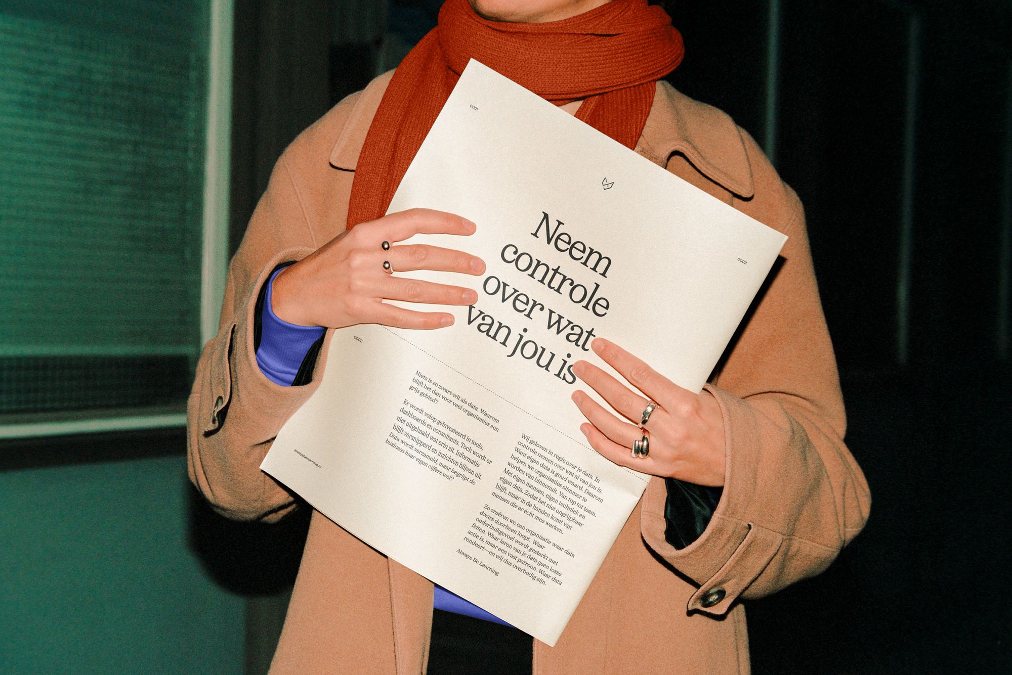
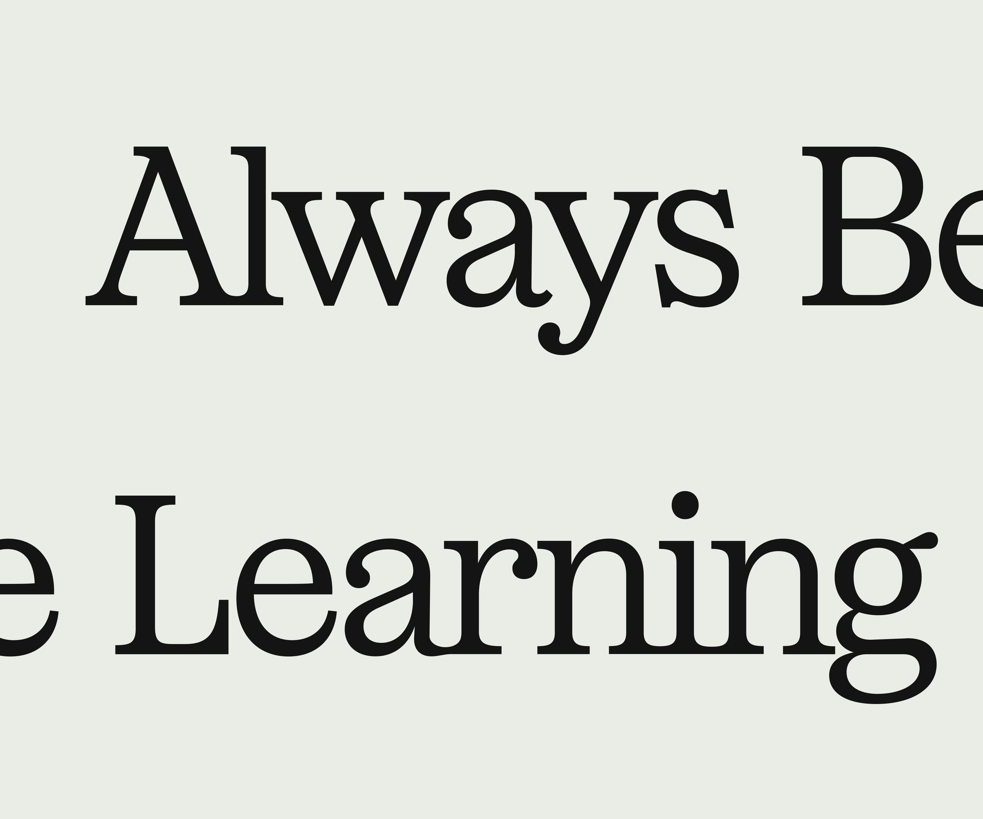
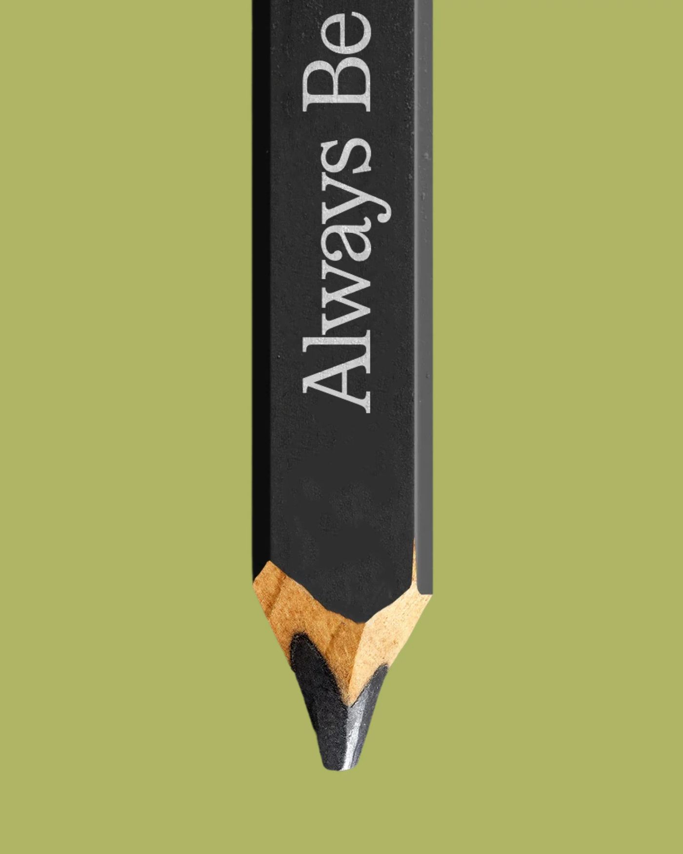

Identity Basics
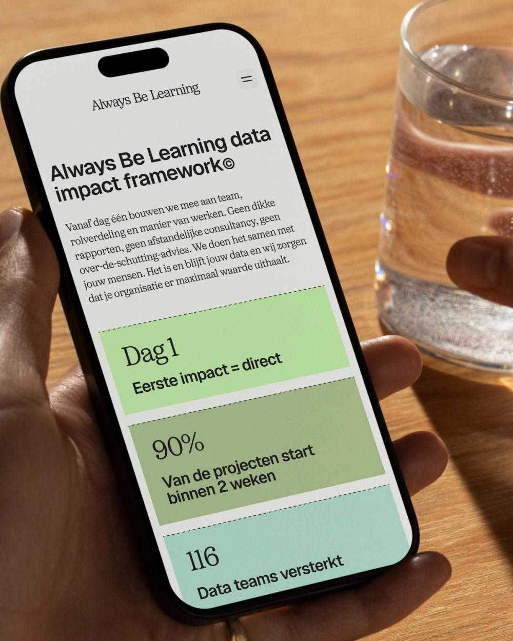
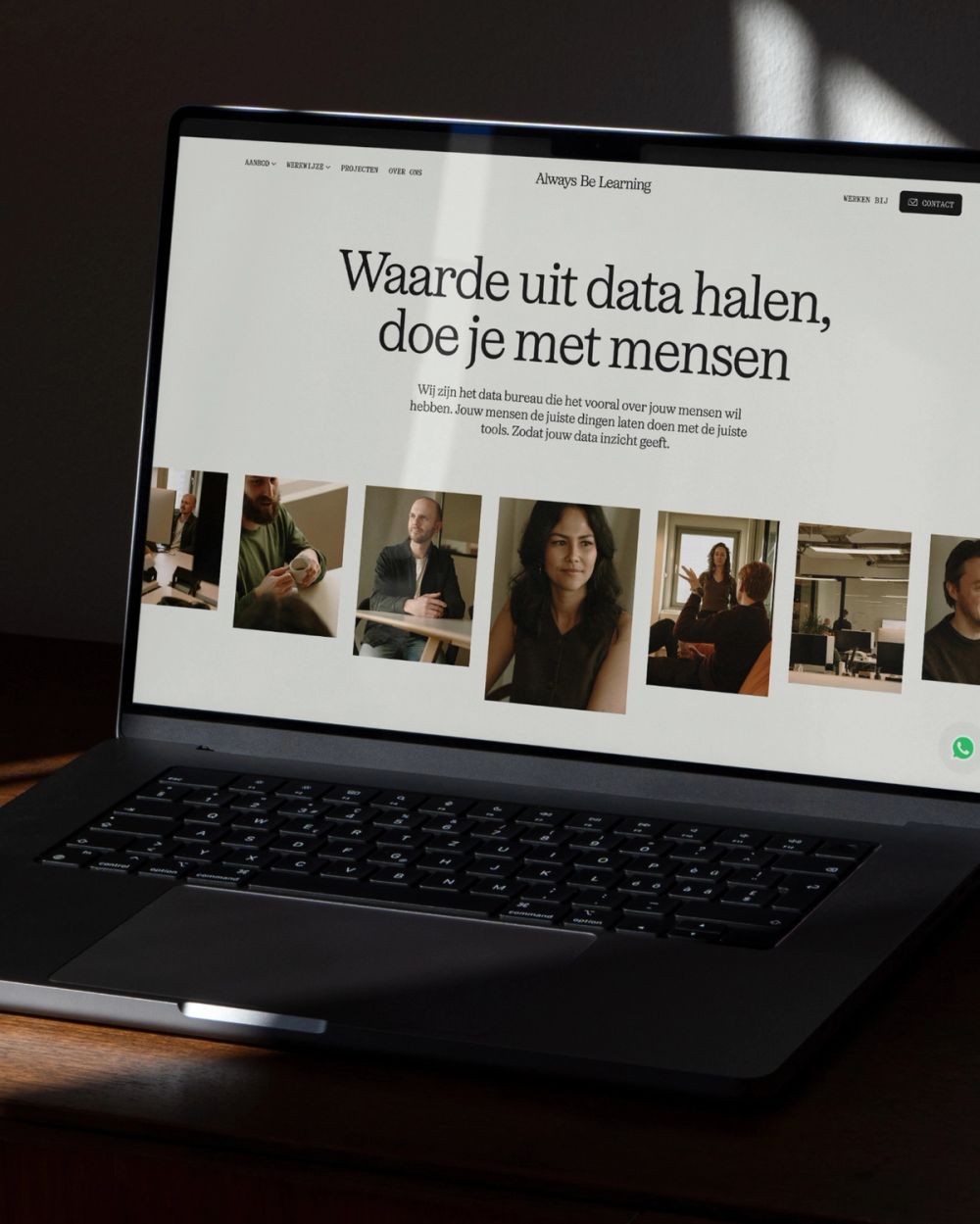
The visual identity reflects the balance between human attention and the precision of data. Calm and structured, yet never cold. A restrained visual system creates clarity, while subtle details and typography introduce warmth and personality. The fox mark was re-touched and now matches a little imperfection, a relic from the companies past that still has a place, but less of a presence. The name, and thus the word mark it self now caries more meaning. The design language is built around four core values: human understanding, refined clarity, strength through calmness, and lasting curiosity. Together, they shape an identity that feels thoughtful, confident, and quietly intelligent.
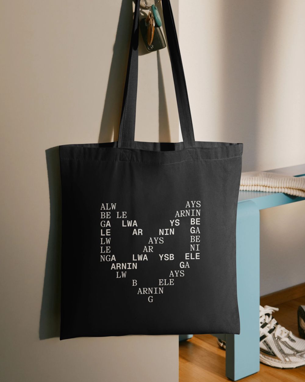


Photography & Illustration
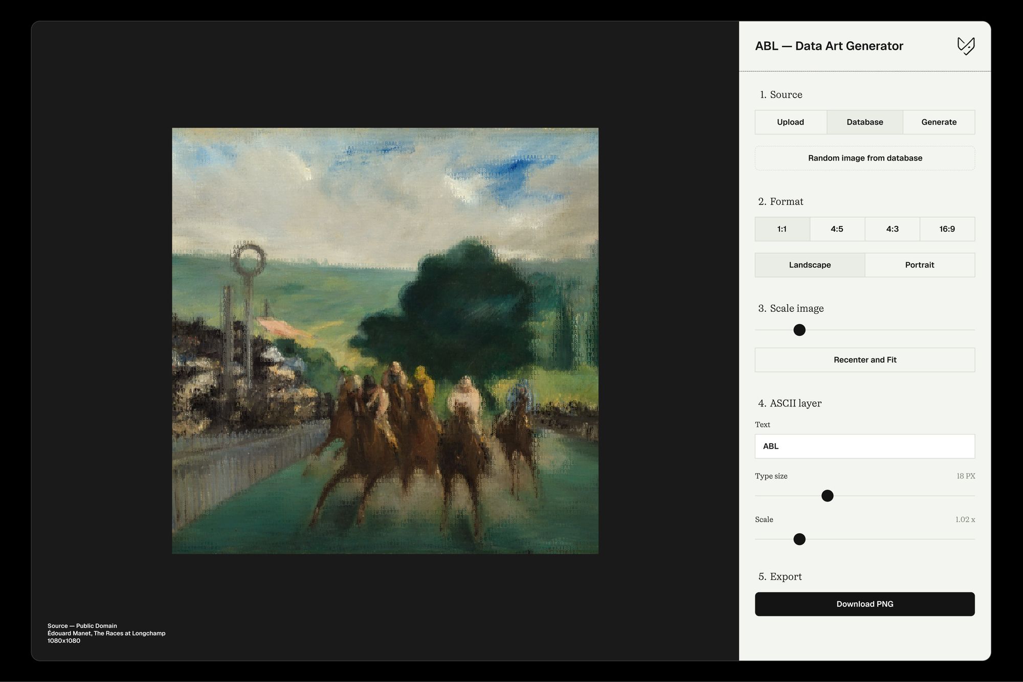
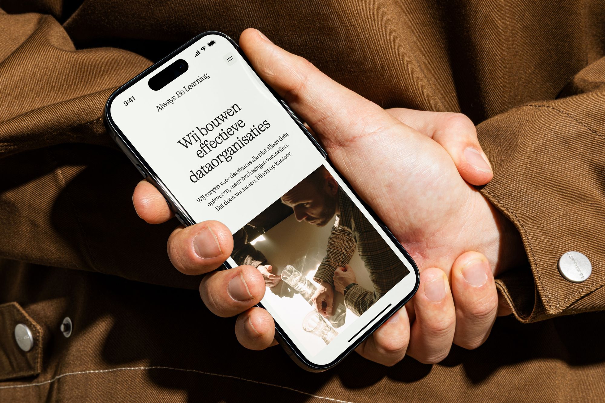
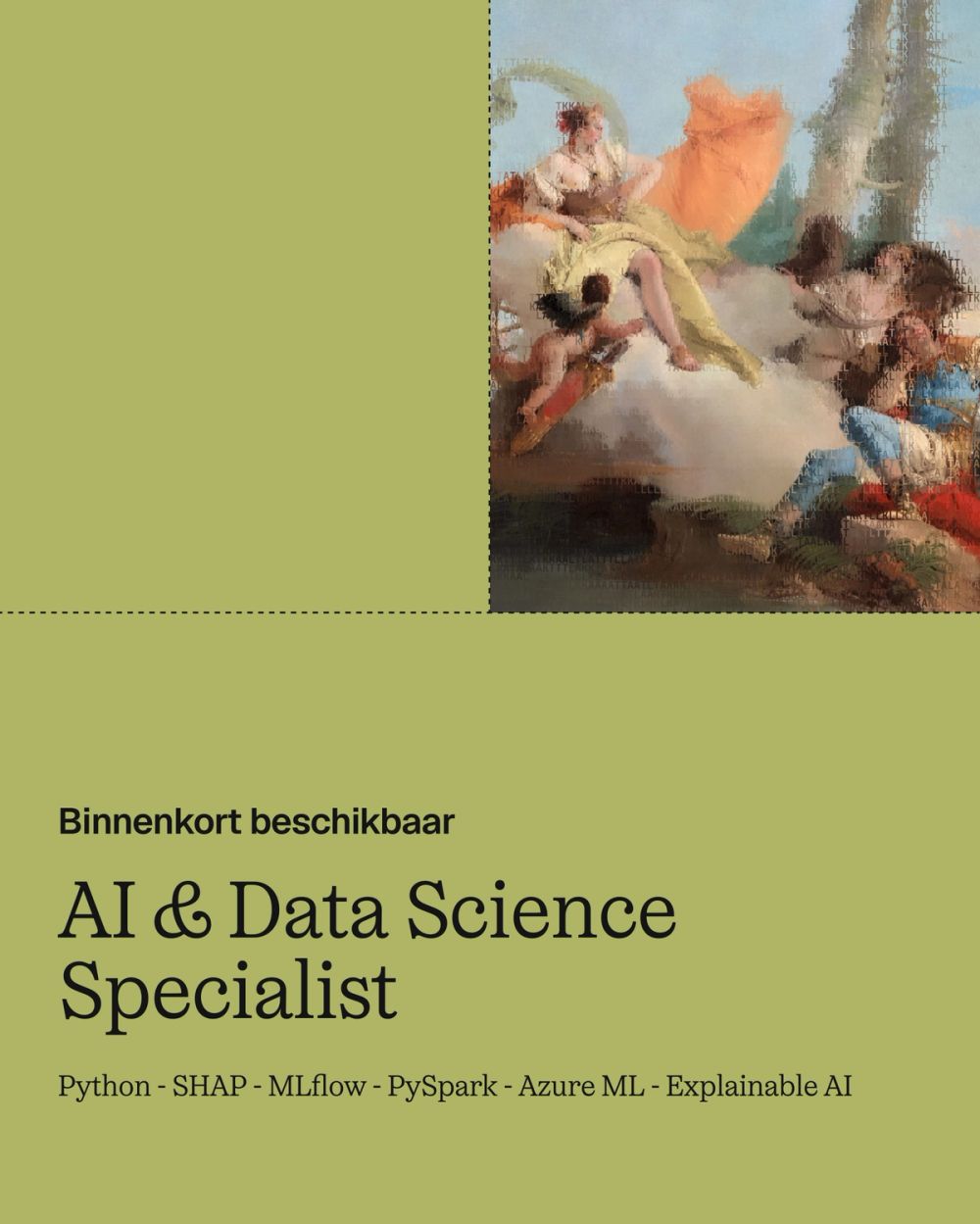
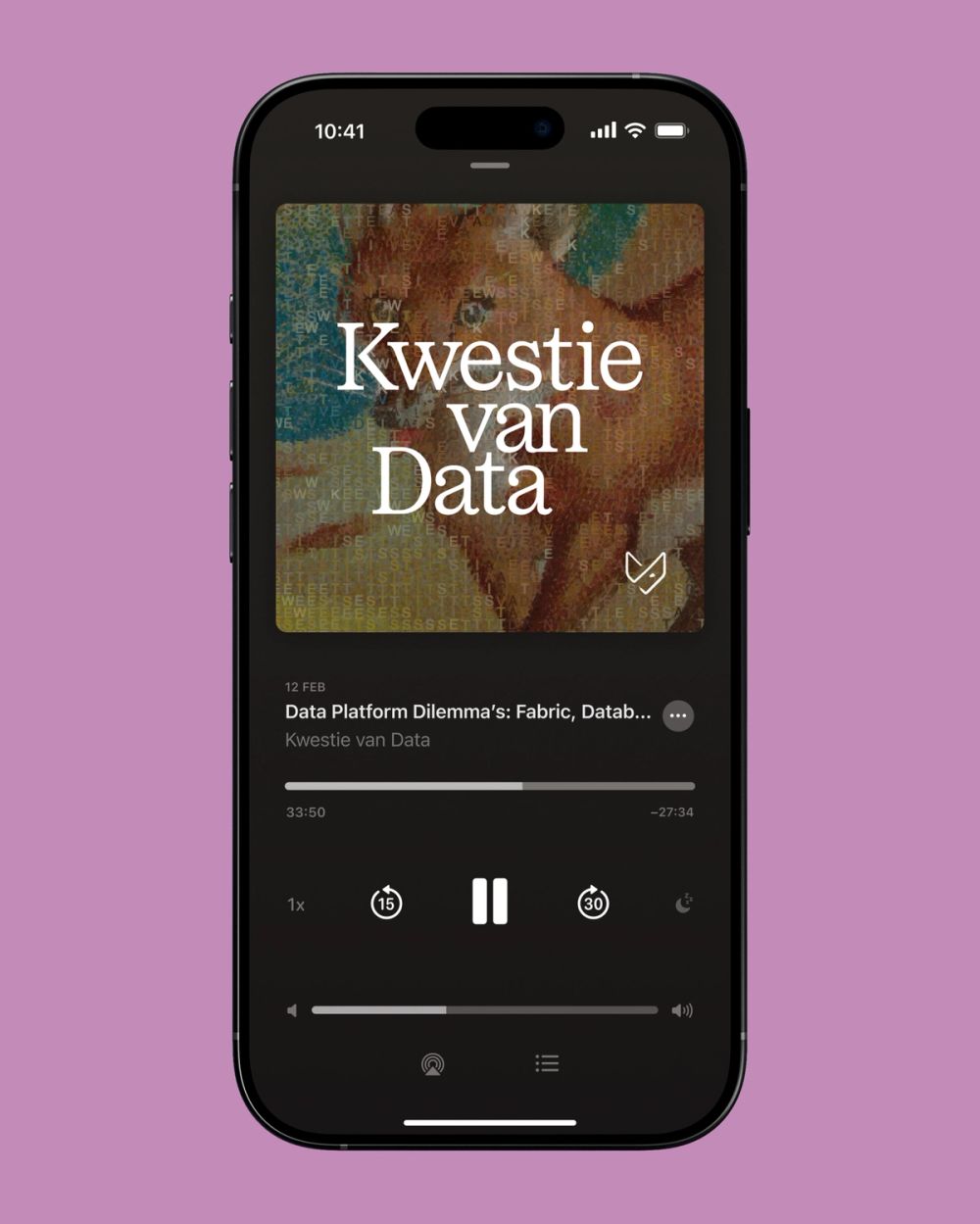
Photography by Kim de Jong brings forward the human side behind the systems and numbers, focusing on the people who work with data every day. Alongside the photography by Kim de Jong, a custom illustration style was developed using a dataset of public domain artworks sourced through Cosmos, combined with a self-built ASCII data filter. The result is a visual language that feels both technical and human, translating data into textured and expressive imagery.

2026
- Role
- Art direction
- Brand designer
- Typography
- Ocean Text
- Geist
- Team
- Anna van den Bijgaart
- Kim de Jong