Clean Inside Out

Introduction
Is washing your car only about having a shiny vehicle? Or is there more to it? Claro is a brand new carwash brand. Planning to reshape the carwash industry with hospitality at the core. Unlike many other carwashes, it believes a clean car is all about feeling great.
Revolves Around You
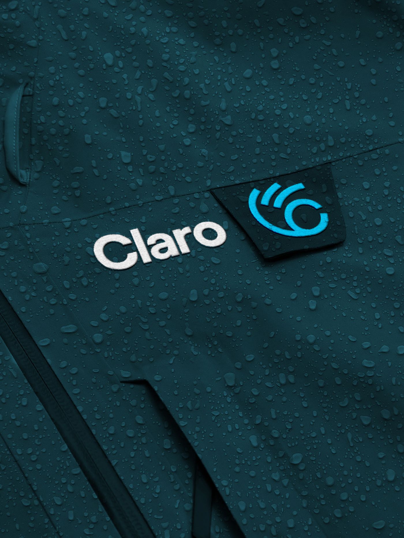
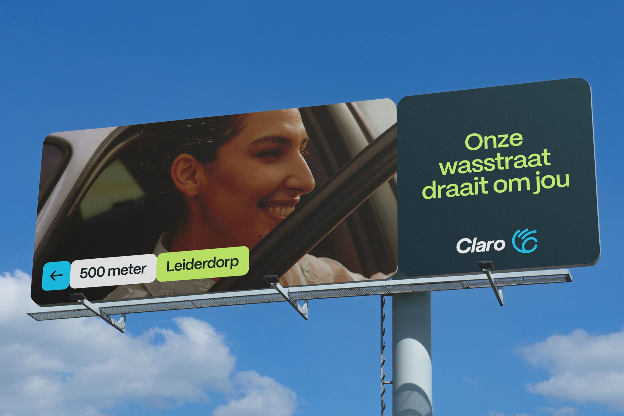
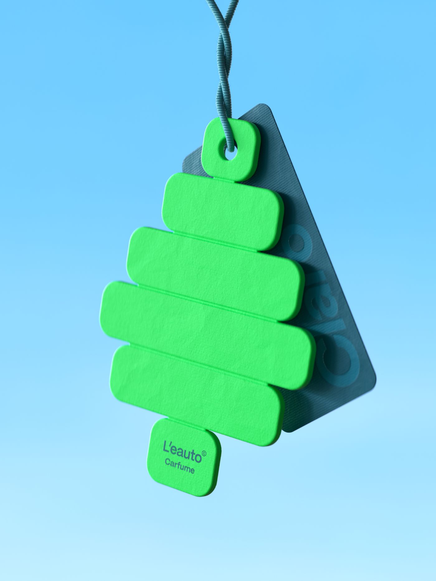
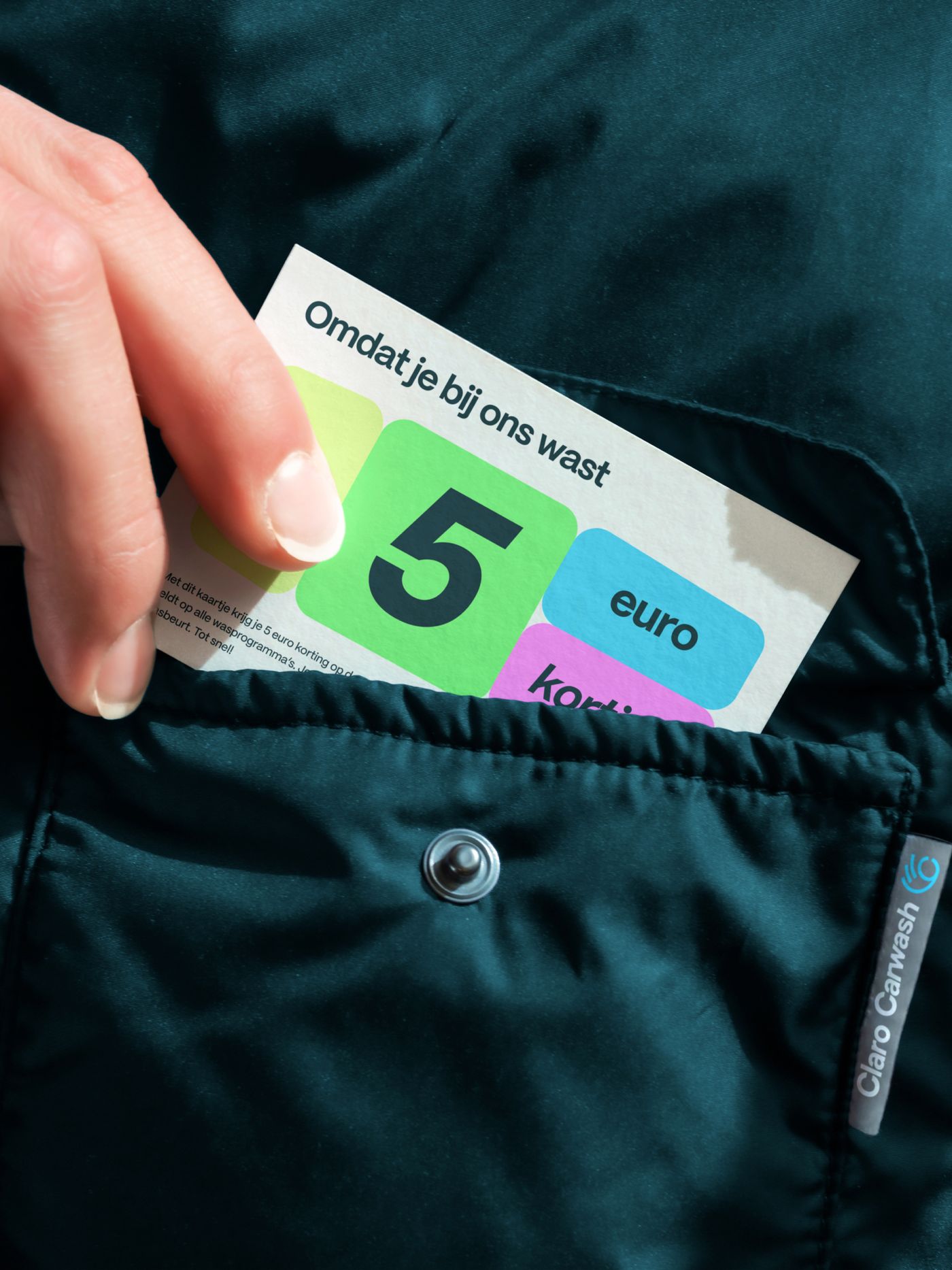
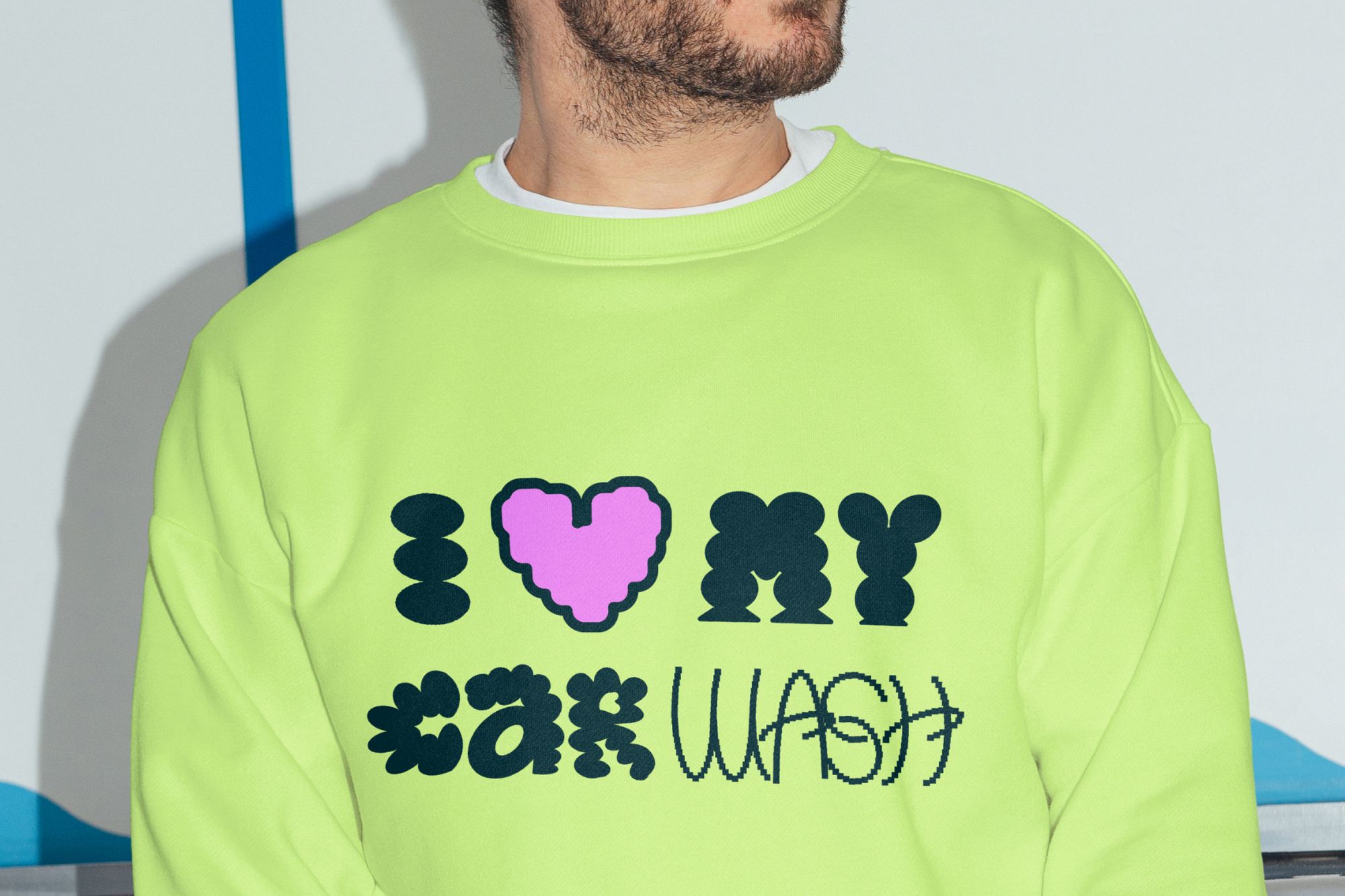
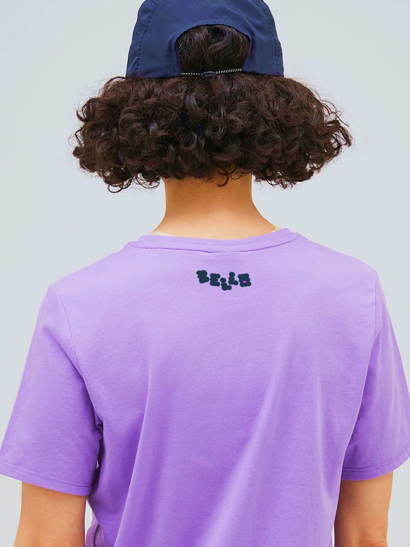
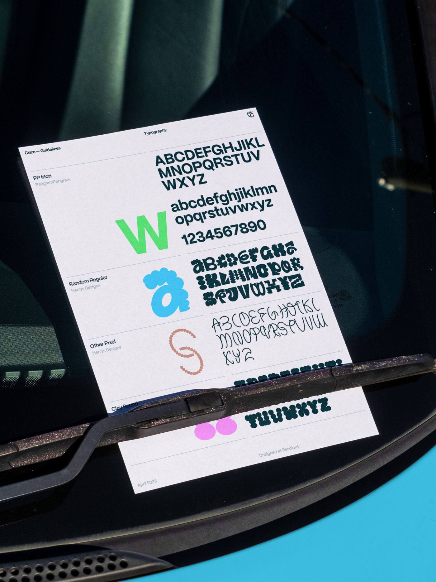
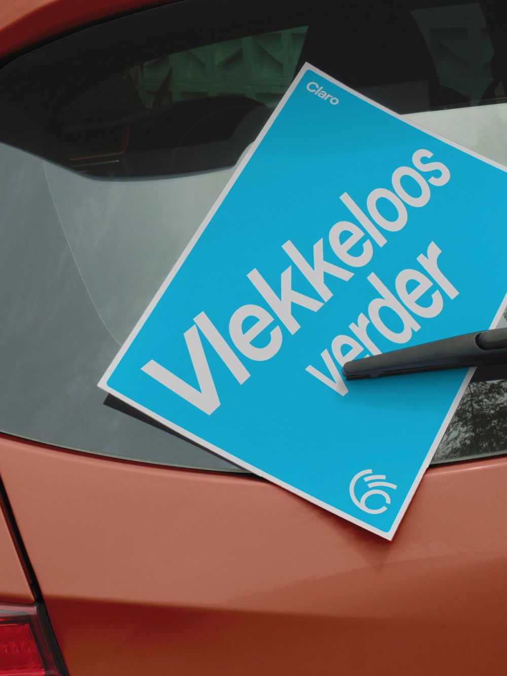
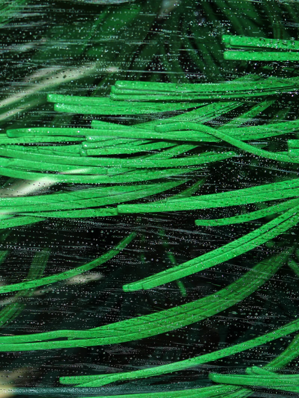
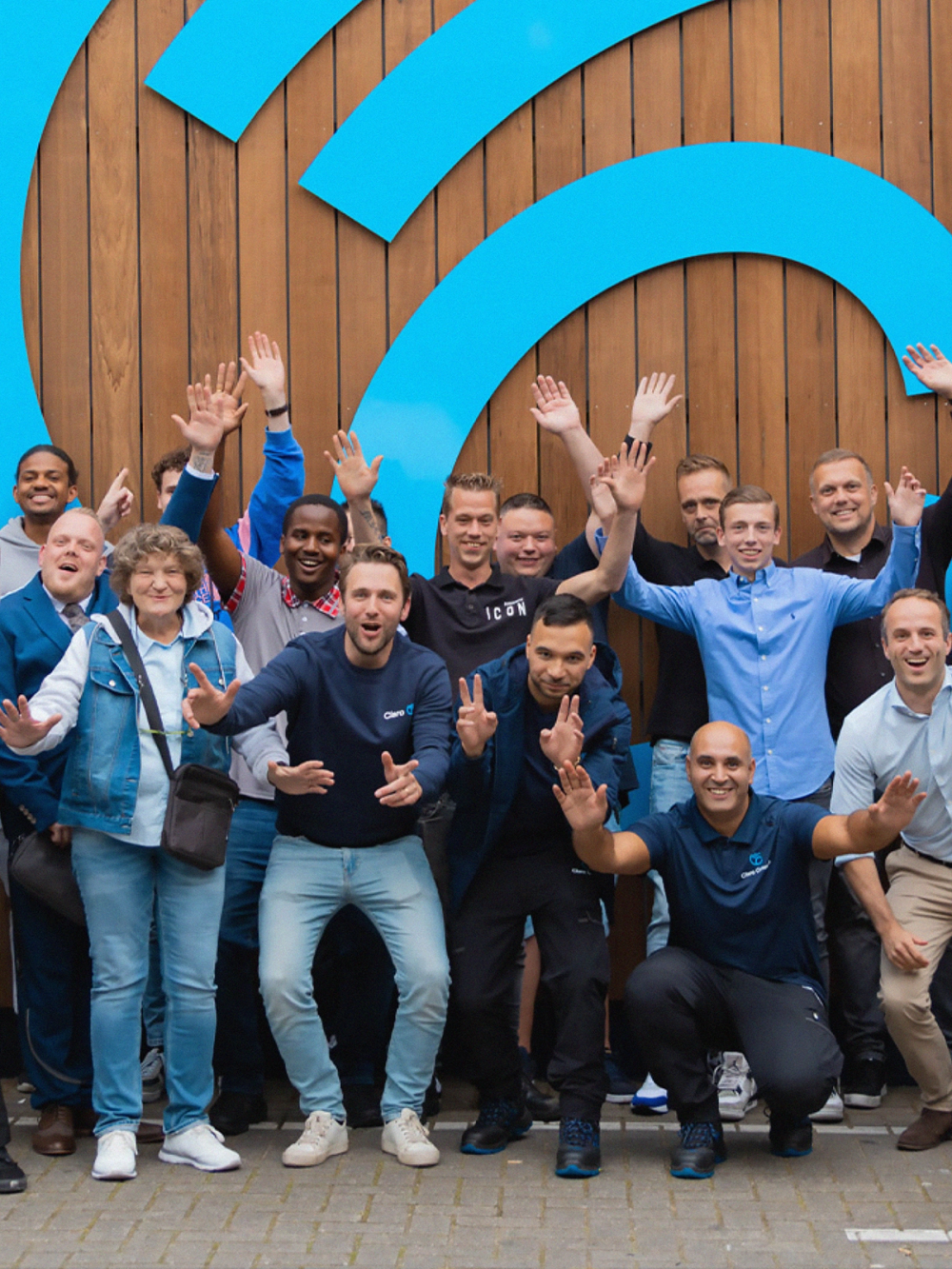
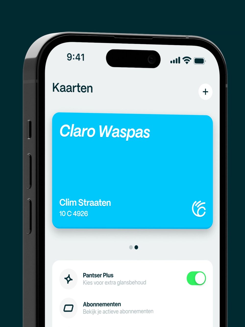
The carwash is a place of constant motion. From the water that flows through, to the cars that roll by. And there’s one thing that stands out above anything else: its big moving brushes. Fascinating young and old alike. These became the base for Claro’s visual language. Wiping and turning. A visual concept that can be translated endlessly on different touch points. Seen from alongside the highway the logo is built as a landmark. The first asset to evoke emotion. It combines Claro’s first letter, the movement of the carwash brush, and the okay-sign. The sign is proudly worn and owned by the whole Claro team. Colors are derived from the cleaning industry. Fresh and poppy, just like the bottles under your sink. Conveying squeaky cleanliness. The typography consists of PP Mori: the Marie Kondō of types. Clear, strong and friendly. The extended type system is packed with carwash references, thanks to Harry’s Designs. Soapy, bulky letters combined with wiping windshield, thin caps that add an expressive and lovable layer to the more functional side of the brand identity. With its new brand identity Claro claims a new position in the market that transcends the pure functionality of washing cars. Claro’s warm interior combined with its fresh, fun branding sets the stage for a love brand that sparks loyalty for clients, as well as employees. Offering the latter a new home for those who worked for their former carwash companies for many years. Creating a place loved by people. Not just by cars.
2023
- Role
- Design direction
- Brand design
- Resoluut
- Anna van den Bijgaart
- Ashley Deckers
- Björn van Ginkel
- Gökhan Kaman
- Jasper Tempel
- Rein van Strien
- Rogier Knoops
- Typefaces
- PP Mori