Create Better

Introduction
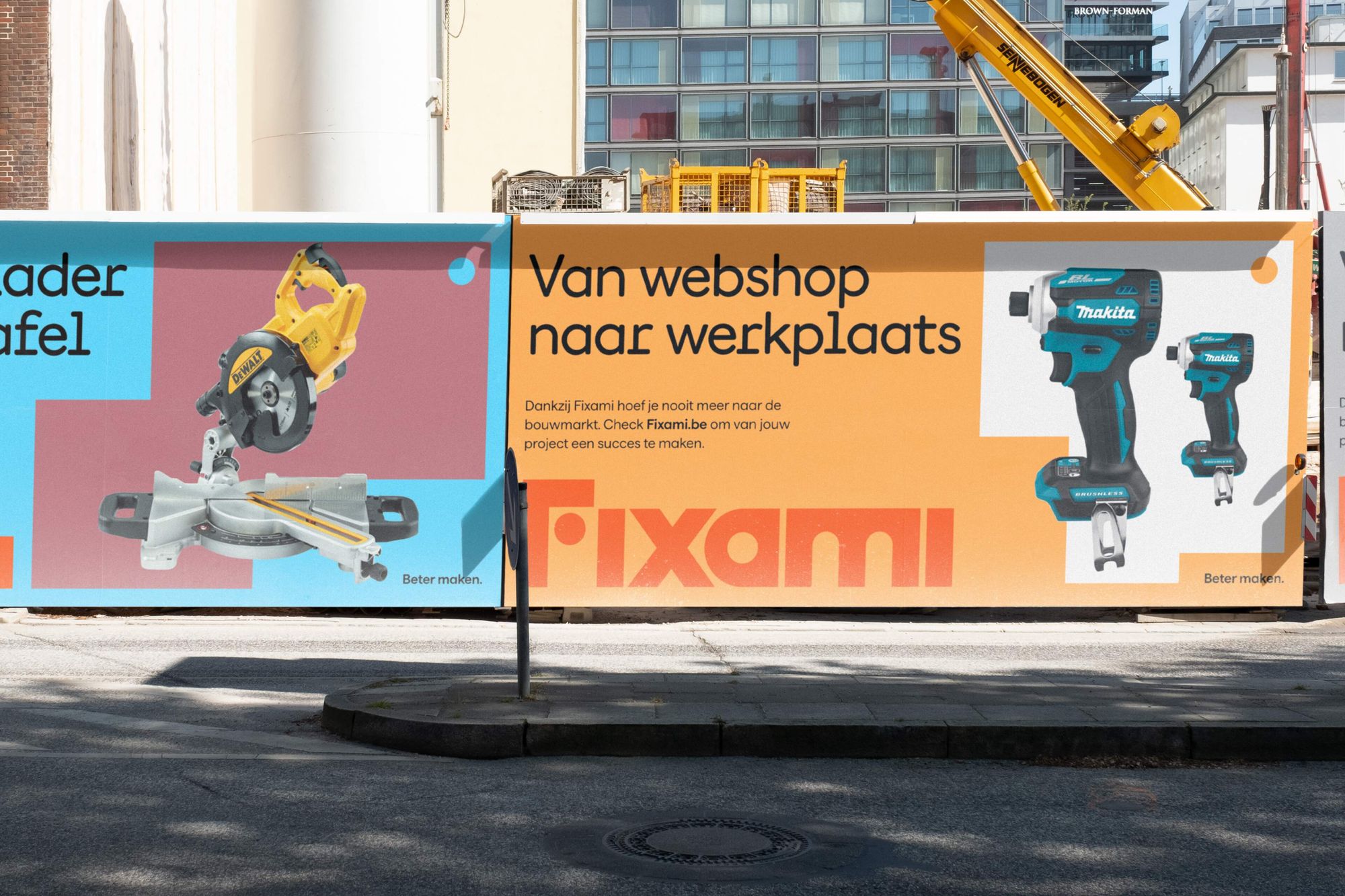
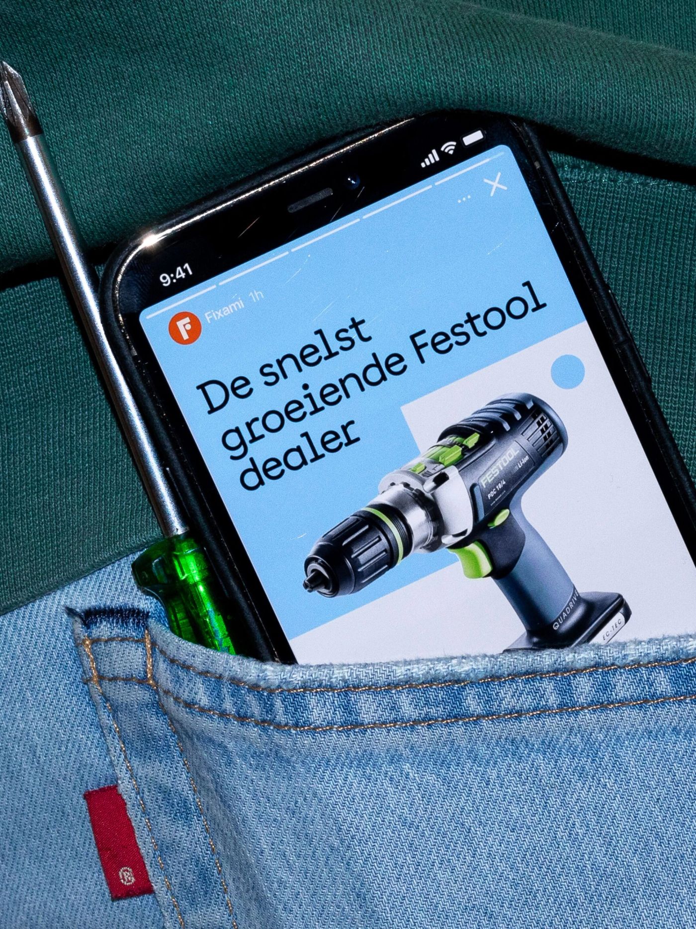
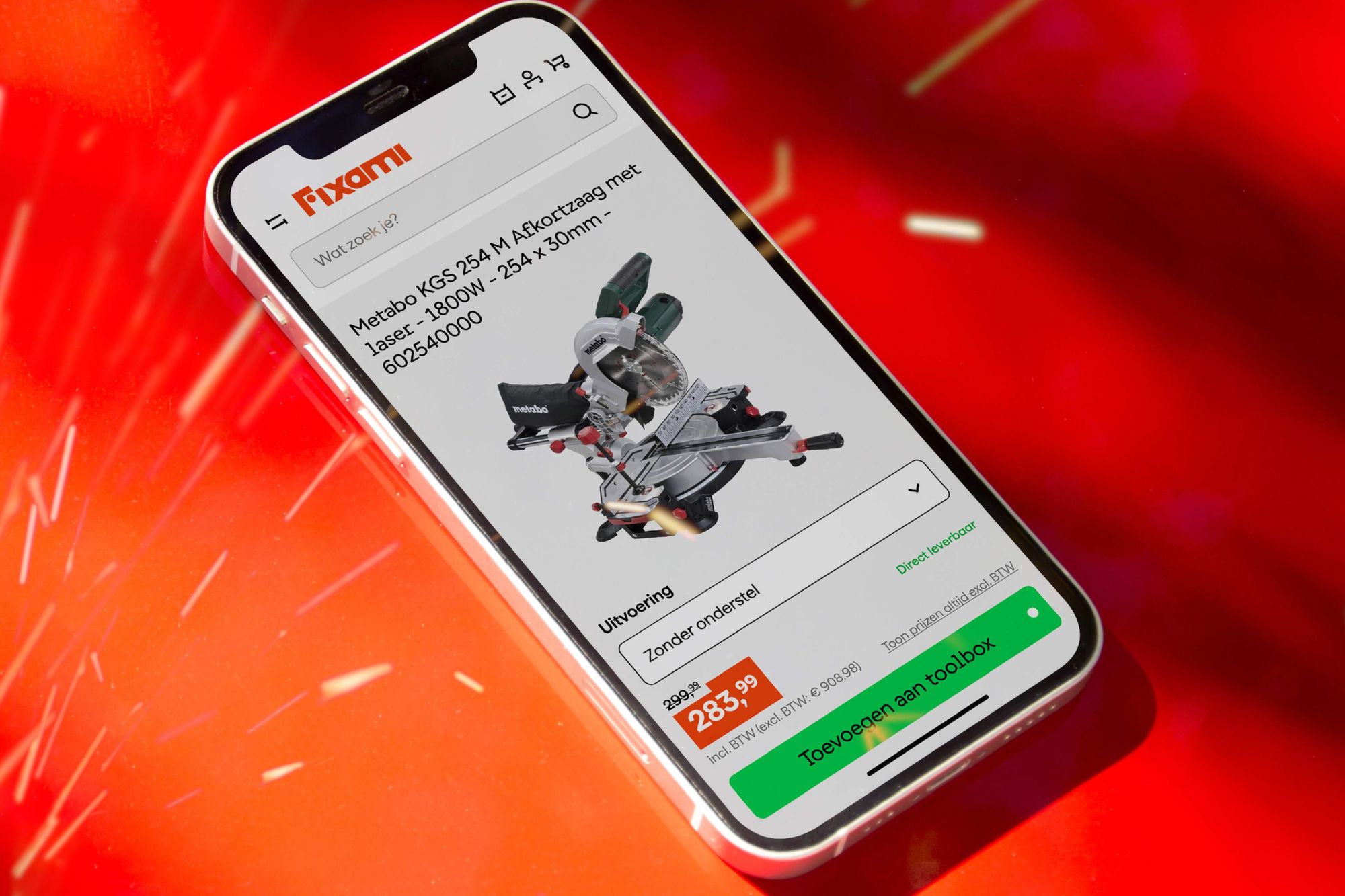
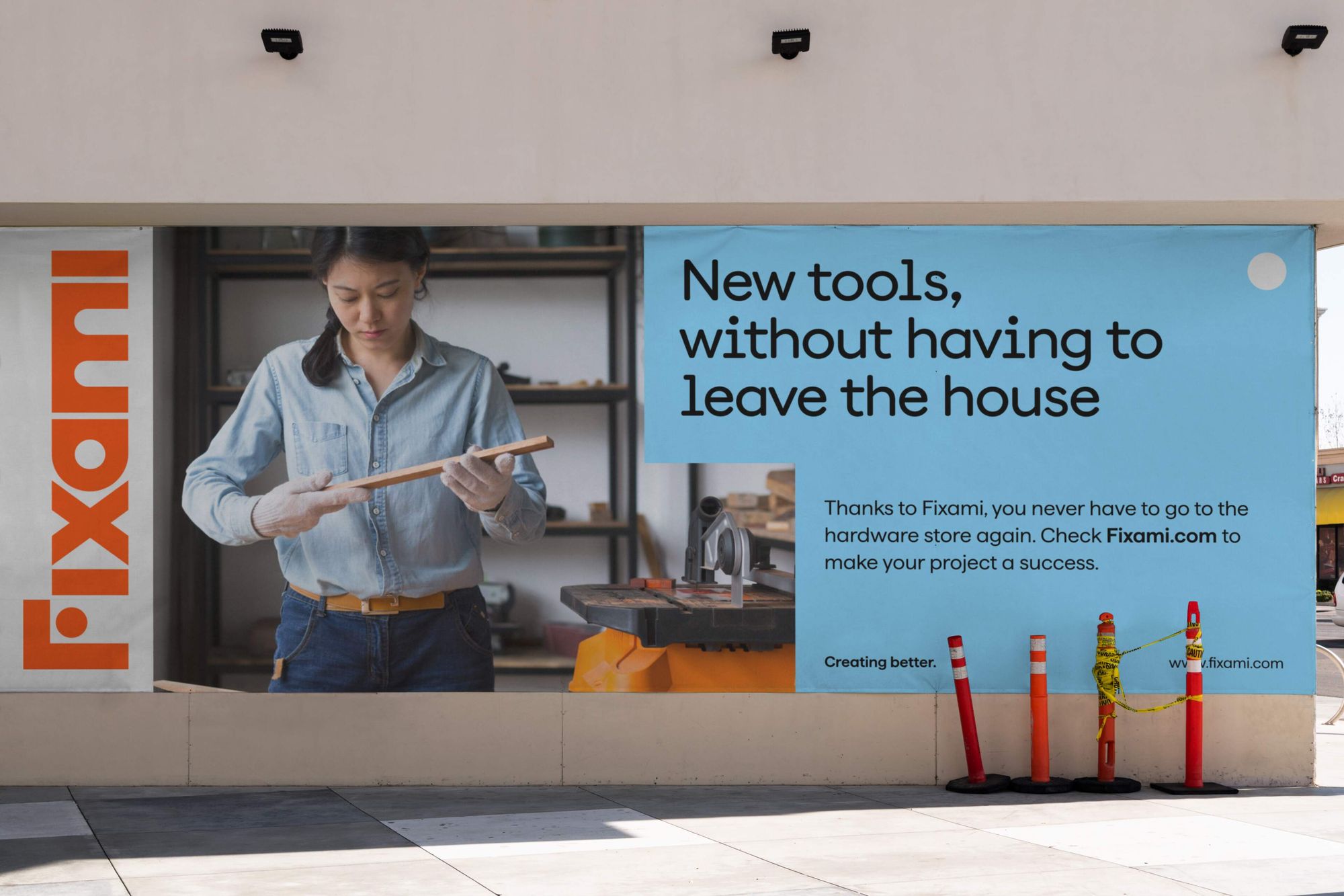
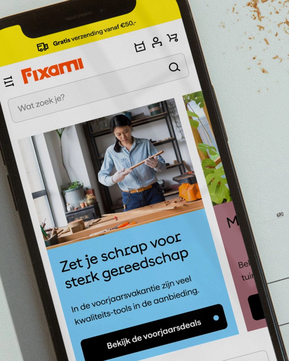
Whether it's a handheld hammer or a powerful pressure washer, Fixami has all you need to get the job done. With its innovative e-commerce platform and extensive and exclusive product range, Fixami caters to DIY'ers as well as professionals. We helped Fixami setting a new standard in a traditional industry. By creating a completely new brand for the entire European market. From strategy and architecture to visual identity and website.

An Eye for Detail
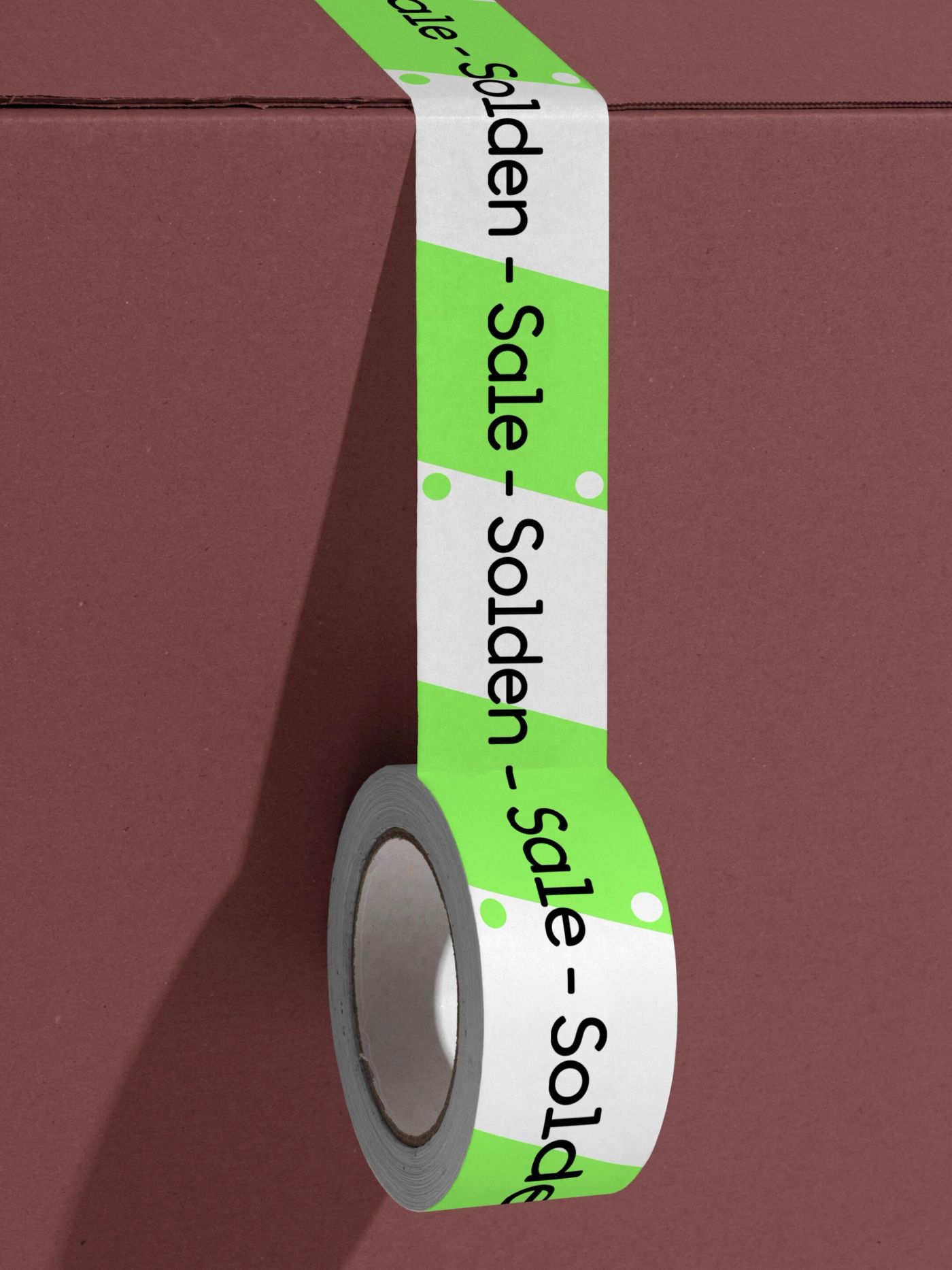
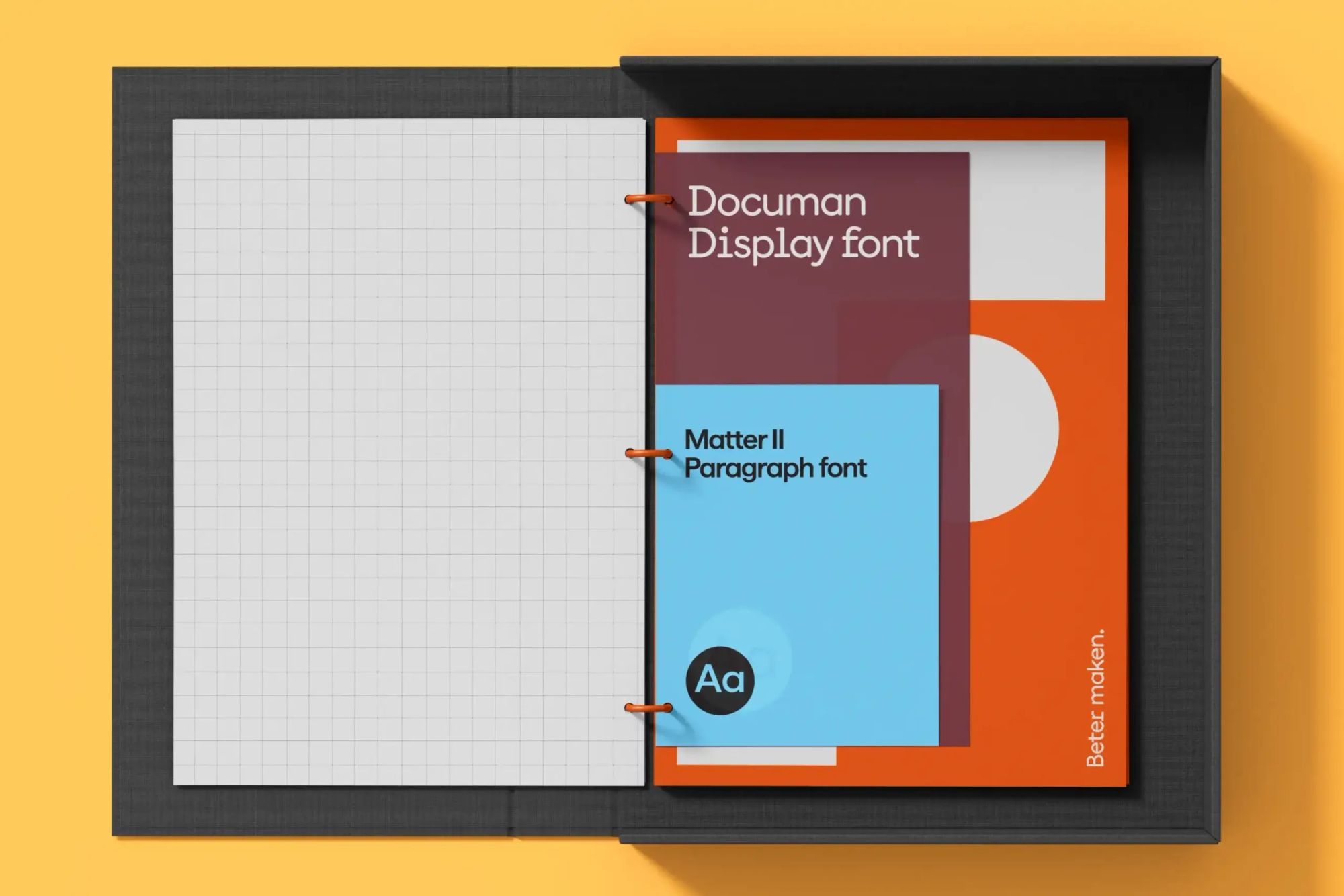
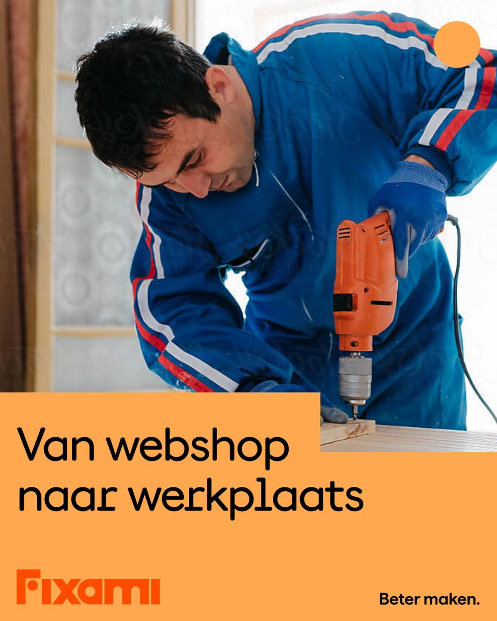
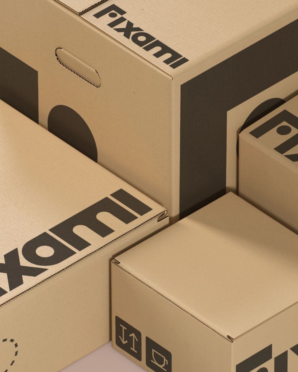
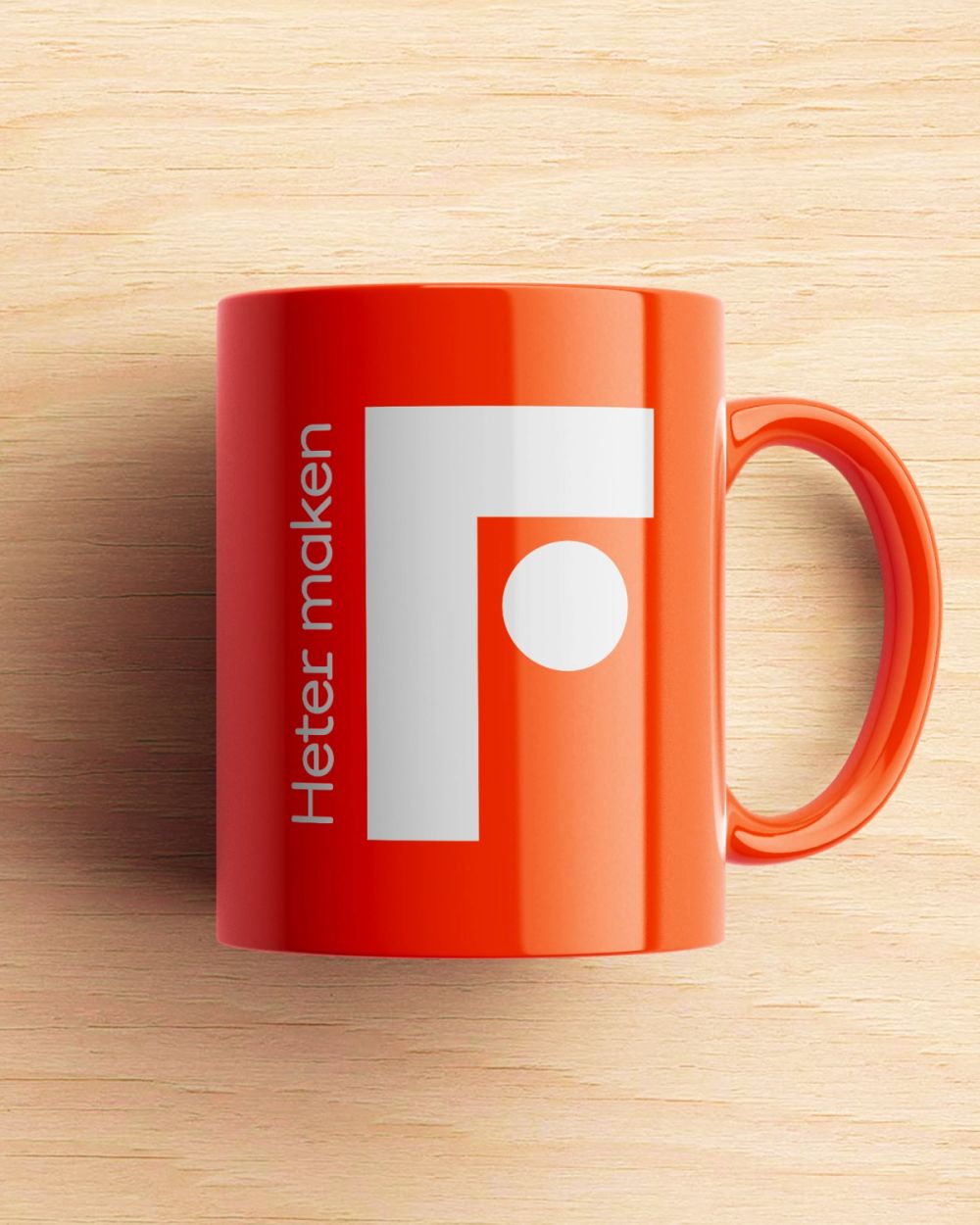
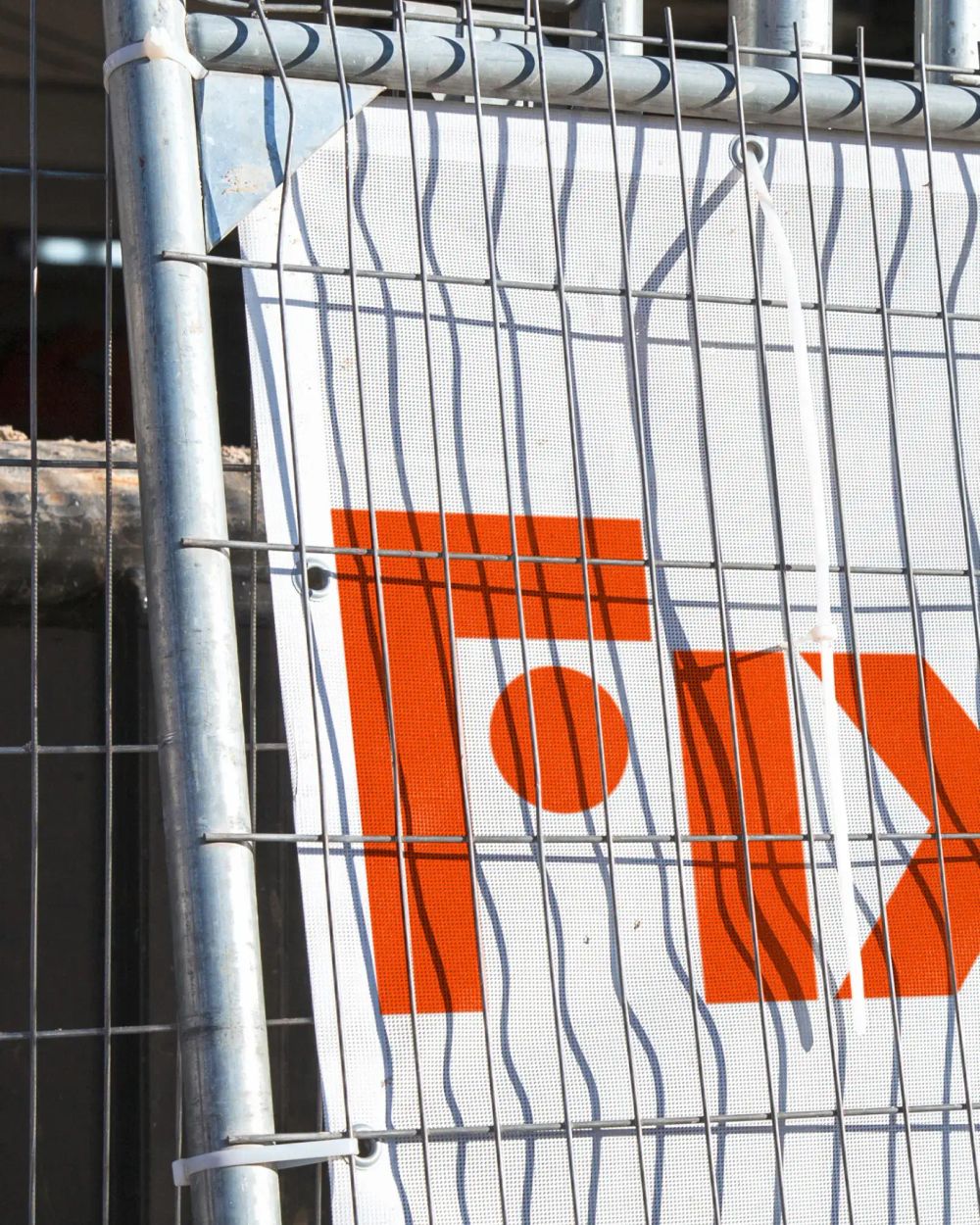
The Dutch word 'Timmermansoog', the so called carpenter's eye, is the base of the visual identity. The one who wields the tool, know's what she or he is doing and is owning the workspace. Resulting in a solid word mark that contains the face and eye of the professional wielding the tools. This way the logo is both strong and friendly. And a layout system that reflects the workshop space: For every task a flexible setup. We partnered with Displaay for a unique typeface pairing. Combining a modern, digital interpretation of a nostalgic letter Documan, with the solid and strong Matter. Resulting in a combination that is both distinctive and accessible. The color palette consists of a powerful signal color, that has its origins in the industry safety. Adding modern supporting colors that complete the digital identity system. Providing Fixami’s employees with all the digital branding tools they need for creating a better e-commerce experience everyday. Topped off with a human no-nonsense brand voice to match the industry's culture, Fixami is now ready to take over Europe. With excited employees fully on board.
2022
- Role
- Design direction
- Brand designer
- Resoluut
- Anna van den Bijgaart
- Eric Pronk
- Jasper Tempel
- Rogier Knoops
- Typefaces
- Documan
- Matter